
Decorating Your Home with Pantone’s 2019 Colour Of the Year
For years, Pantone’s Colour of the Year has influenced product design in industries from fashion and home furnishings to graphic design. Colour experts at Pantone’s Colour Institute take time to consider new colour influences from all types of industries – film, art collections, popular travel destinations and even up-coming sporting events – to conclude which will become the colour of the year.
This year, Living Coral (or Pantone 16-1546) reigns supreme. This is a warm, peachy orange shade that Pantone has stated “welcomes and encourages lighthearted activity” and “symbolizes our innate need for optimism and joyful pursuits.” What a better colour to introduce into our home interior! Here’s how…
Very Vintage
This is a shade that pairs well with almost anything deemed vintage. Whether it be an antique brown side table or a brass light fitting, Living Coral will add a modern twist to your older items which is great news for those who tend to update their interiors around items they already own. Even interiors that aren’t necessarily vintage can benefit from the shade, including understated sliding door wardrobes.
Highlight It in Homewares
Expect Living Coral to appear in homewares such as cushions, rugs, throws and bedding. This is definitely one of the easiest ways to incorporate this on-trend colour into your décor and it’s a low-risk way to test out whether it’s one you want to see more. At the same time, while coral tends to be a colour that’s used more as an accent, we’re seeing designers embrace it on a larger scale, on sofas and in feature walls.
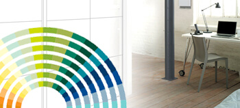
Pick the Perfect Palette
Alongside choosing this year’s colour, the Pantone team provide us with some suggested palettes that can help to inspire our interior design choices. Some of this year’s include the Under the Sea palette which combines Living Coral with a variety of other corals including the softerCoral Sands (14-1224) and the pink Sunkist Coral (17-1736) as well as the rather aptly named Trippy palette which mixes the bright colours of Sulphur Spring (13-0650) with Barrier Reef (17-4530) and Vivacious (19-2045) to create an interior straight from the 1970’s.
Bold and Beautiful Botanicals
Nature-inspired prints can be hung anywhere in the home – the kitchen, bedroom or even a bathroom and it’s never surprising to see coral shades in such designs. These are designs that can be paired with any type of furniture, whether modern or antique.
For years, Pantone’s Colour of the Year has influenced product design in industries from fashion and home furnishings to graphic design. Colour experts at Pantone’s Colour Institute take time to consider new colour influences from all types of industries – film, art collections, popular travel destinations and even up-coming sporting events – to conclude which will become the colour of the year.
This year, Living Coral (or Pantone 16-1546) reigns supreme. This is a warm, peachy orange shade that Pantone has stated “welcomes and encourages lighthearted activity” and “symbolizes our innate need for optimism and joyful pursuits.” What a better colour to introduce into our home interior! Here’s how…
Very Vintage
This is a shade that pairs well with almost anything deemed vintage. Whether it be an antique brown side table or a brass light fitting, Living Coral will add a modern twist to your older items which is great news for those who tend to update their interiors around items they already own. Even interiors that aren’t necessarily vintage can benefit from the shade, including understated sliding door wardrobes.
Highlight It in Homewares
Expect Living Coral to appear in homewares such as cushions, rugs, throws and bedding. This is definitely one of the easiest ways to incorporate this on-trend colour into your décor and it’s a low-risk way to test out whether it’s one you want to see more. At the same time, while coral tends to be a colour that’s used more as an accent, we’re seeing designers embrace it on a larger scale, on sofas and in feature walls.
Pick the Perfect Palette
Alongside choosing this year’s colour, the Pantone team provide us with some suggested palettes that can help to inspire our interior design choices. Some of this year’s include the Under the Sea palette which combines Living Coral with a variety of other corals including the softerCoral Sands (14-1224) and the pink Sunkist Coral (17-1736) as well as the rather aptly named Trippy palette which mixes the bright colours of Sulphur Spring (13-0650) with Barrier Reef (17-4530) and Vivacious (19-2045) to create an interior straight from the 1970’s.
Bold and Beautiful Botanicals
Nature-inspired prints can be hung anywhere in the home – the kitchen, bedroom or even a bathroom and it’s never surprising to see coral shades in such designs. These are designs that can be paired with any type of furniture, whether modern or antique.
We specialise in quality wardrobes including shaker sliding door wardrobes, mirrored sliding door wardrobes and more. Contact our showroom for help and advice or stretch the limits of your imagination with our online bespoke door designer.